Menu

The Bee Society
Our Solution
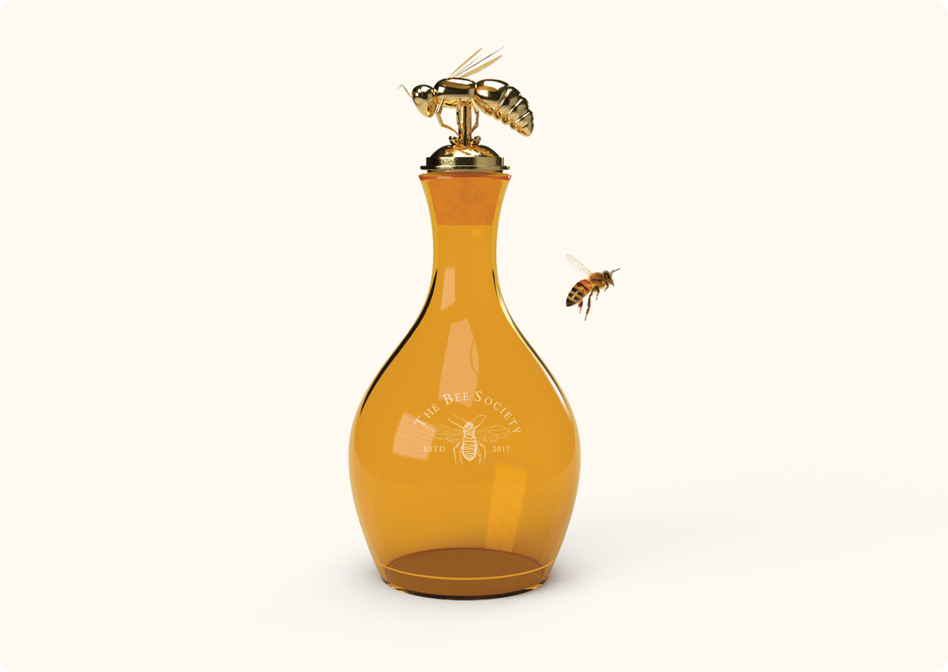
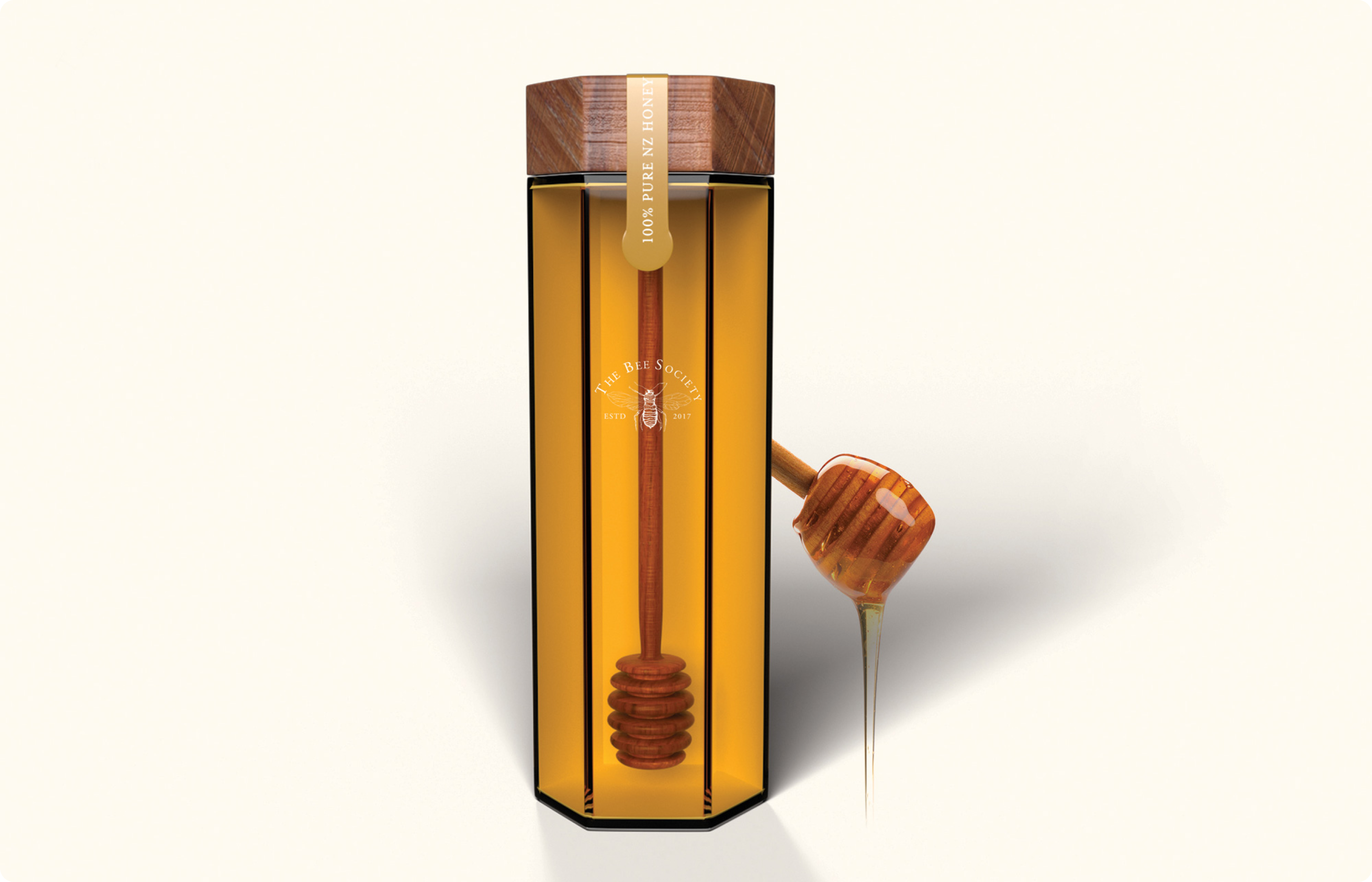
The packaging for The Bee Society presented the unique challenge of encapsulating the essence of New Zealand and the unparalleled quality of Manuka honey. Our design needed to not only stand out but also convey a sense of luxury and exclusivity to The Bee Society’s overseas clients.
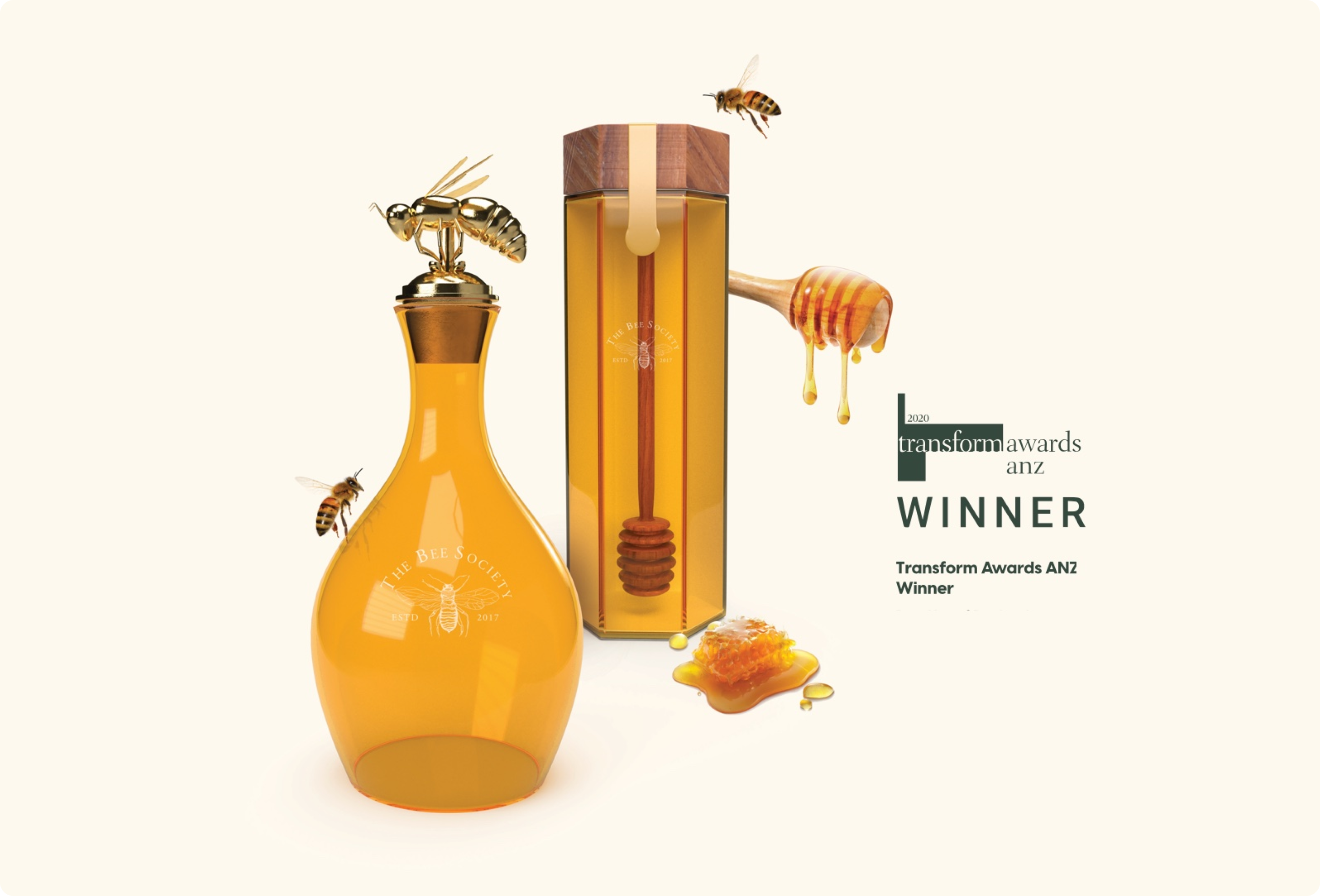
We crafted a design that mirrored the honey's natural beauty, using a hexagonal shape to symbolise the honeycomb and an hourglass silhouette – topped with a bee as a guardian of what has been created by other bees and the beekeeper – to evoke a sense of permanence. The packaging was meticulously designed to be both visually striking and functional, ensuring the product was presented in the most luxurious manner.
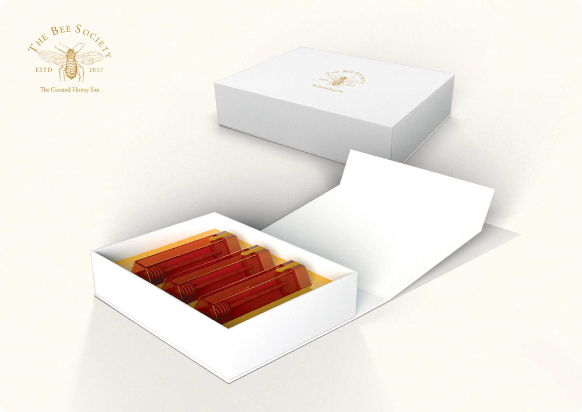
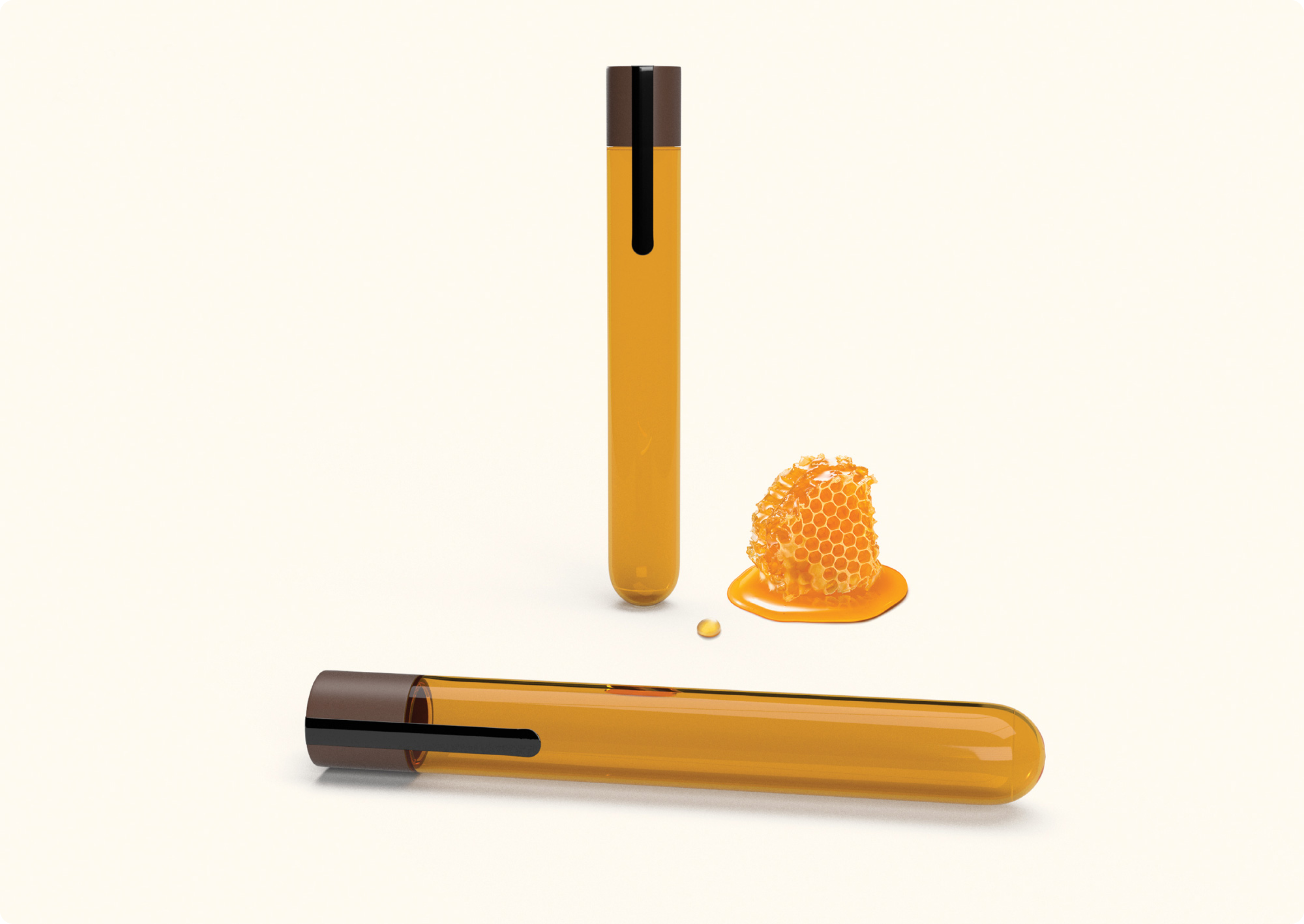
To enhance the overall gifting experience, we developed a premium presentation box that evokes a sense of luxury and anticipation. This meticulously crafted packaging elevates the product, transforming it into a truly exceptional gift. By blending artistry with strategic thinking, we created a packaging solution that elevated The Bee Society's brand while also telling a compelling story about New Zealand’s natural treasures that resonated with their discerning clientele.
