Menu
Hubbards
QUENTOSITY GROUP AGENCY
Mantis DigitalCapabilities
E-commerce Website Design & Development / SEO & SEMOur Solution
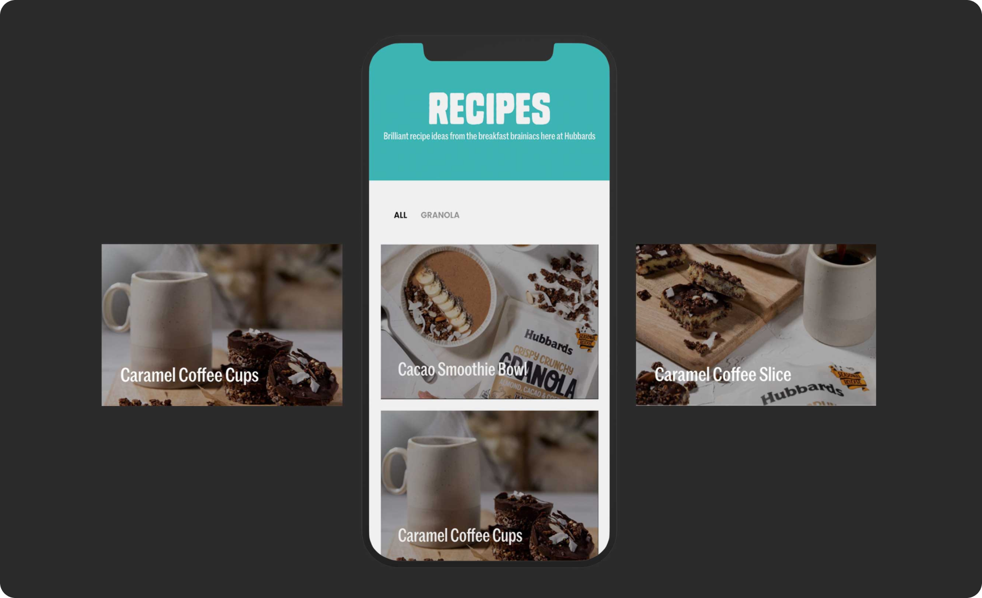
We built an innovative and creative new site with a highly functional e-commerce platform allowing Hubbards to sell directly to customers online. It not only showcases Hubbards’ extensive range of products but also serves as an informational resource providing recipes featuring their products.
We also implemented an automated integration between their WooCommerce platform and Facebook/Instagram Business Manager. This eliminated the need for manual product uploads, streamlining their social commerce strategy and ensuring their product data remained consistent across platforms.

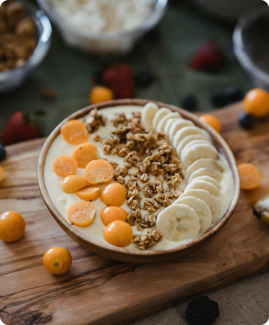
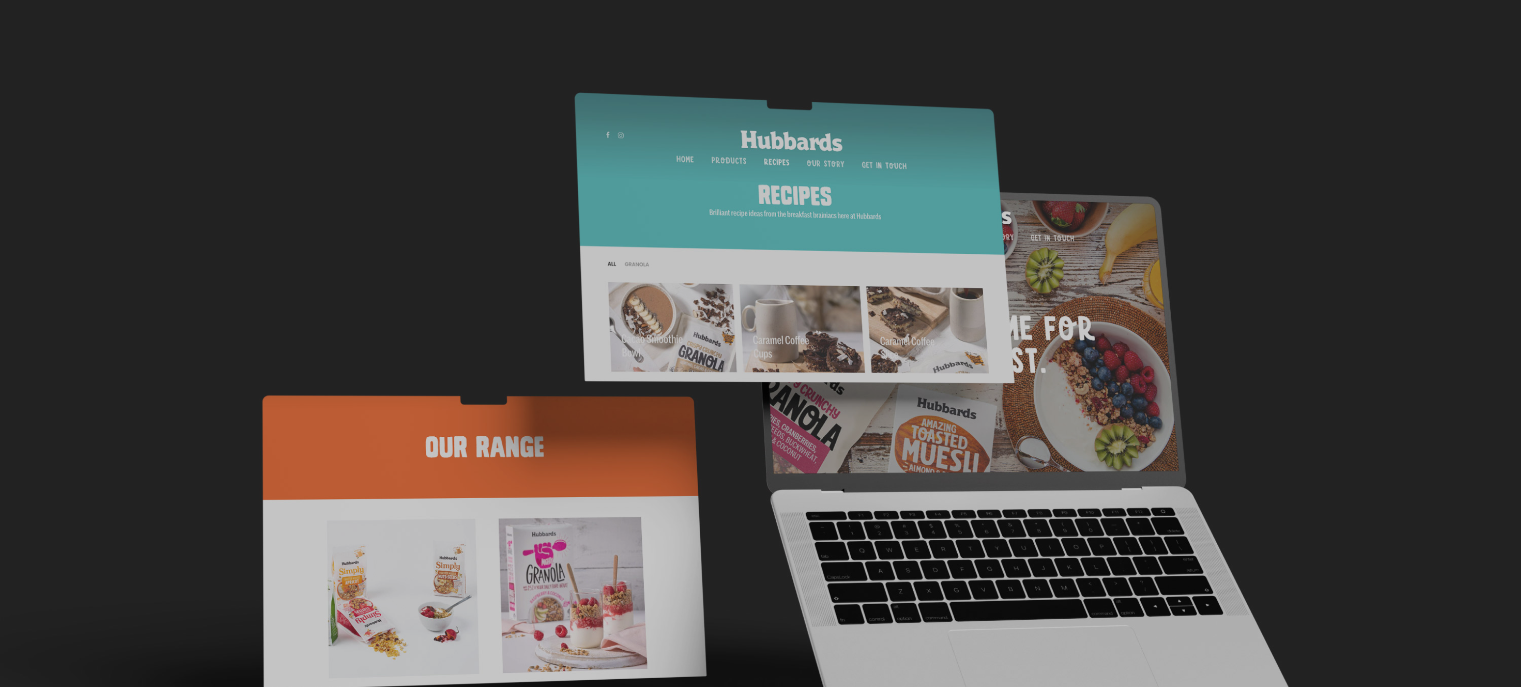
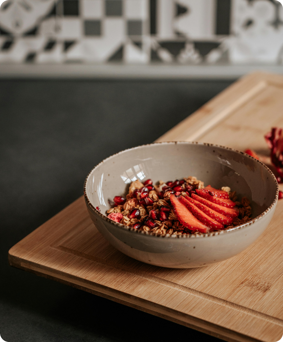
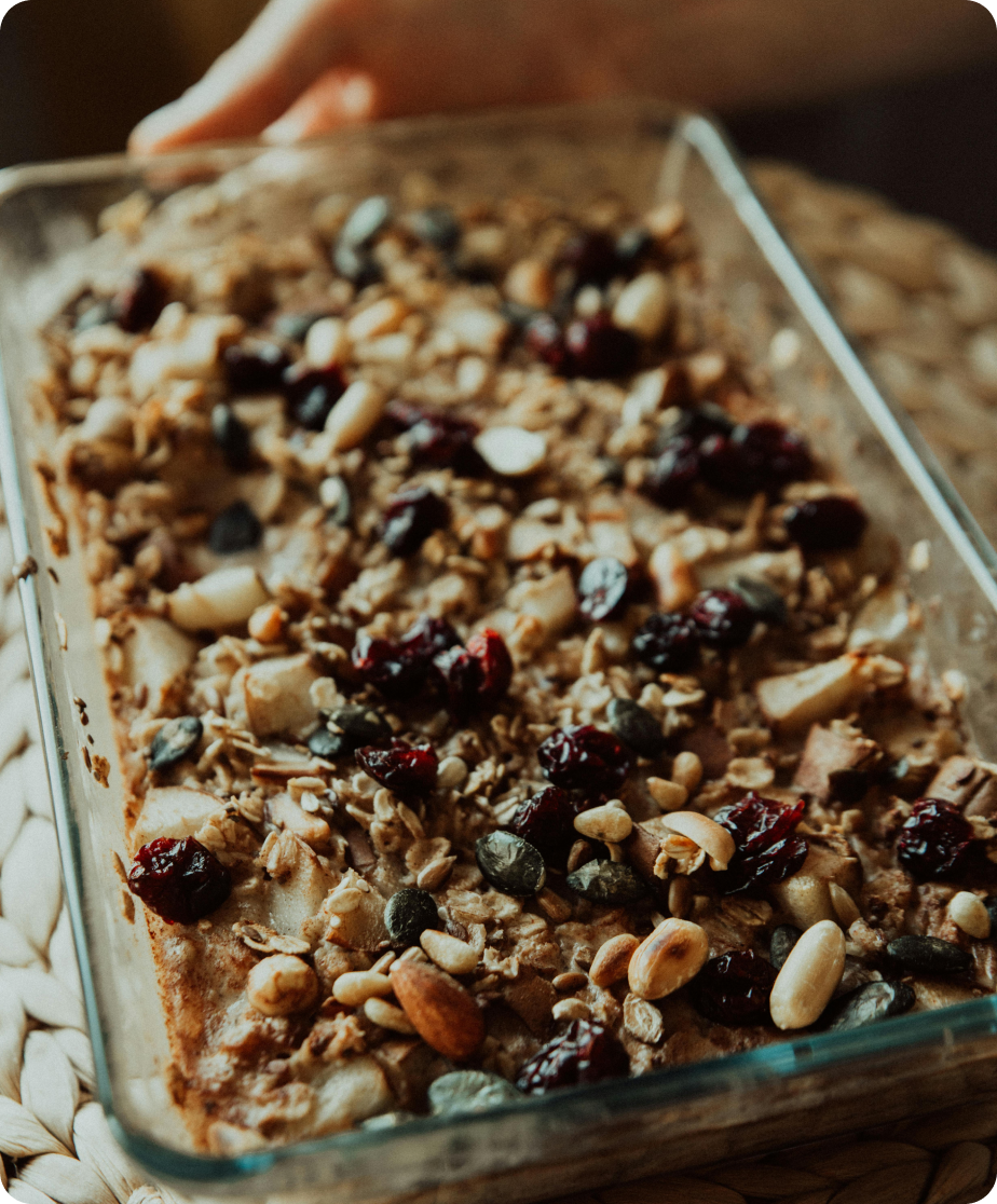
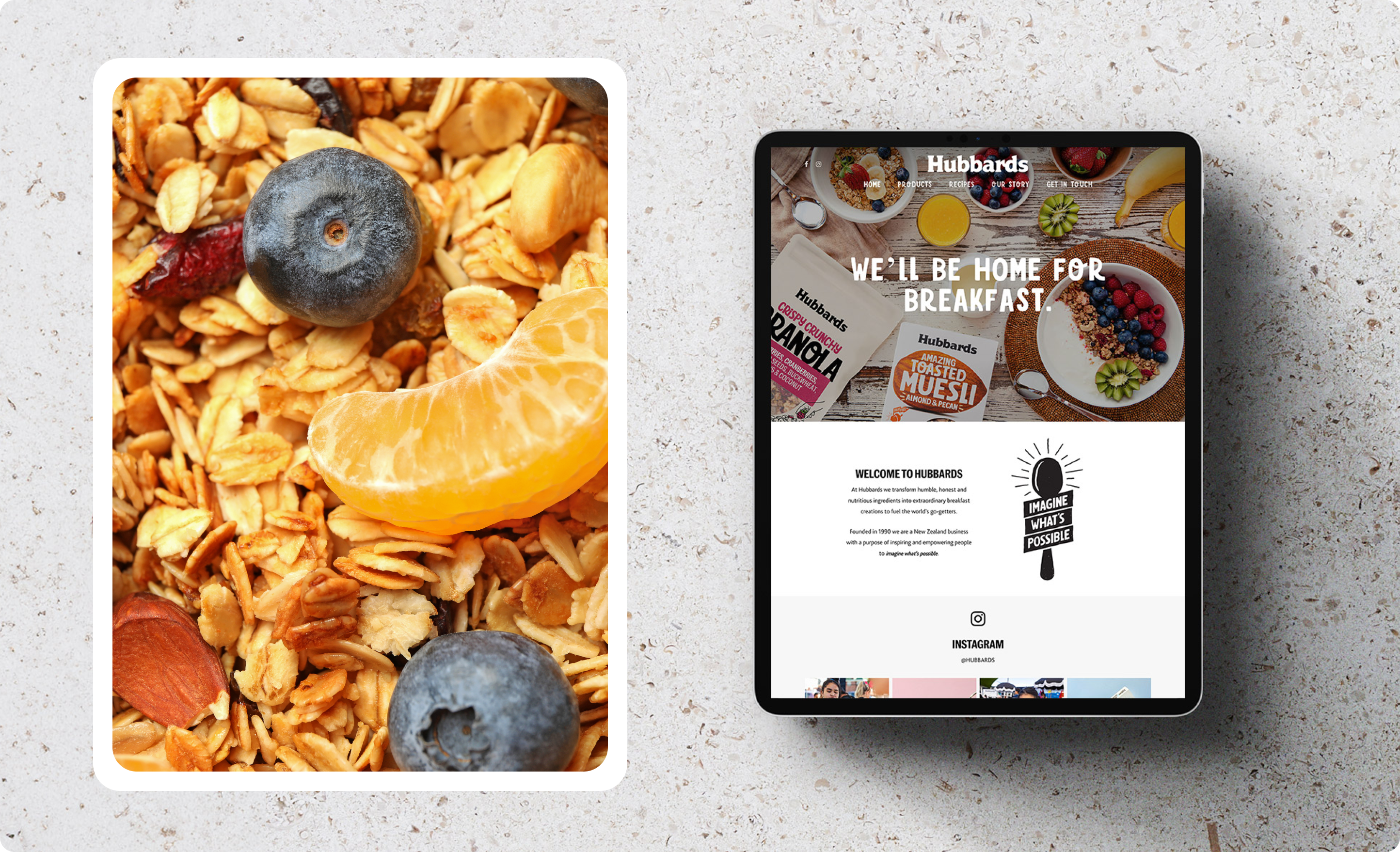
The Hubbards’ website redesign features enticing food visuals throughout. These strategic design elements go beyond showcasing products – they capture visitors' attention and inspire them to get excited about creating delicious meals using Hubbards’ products.
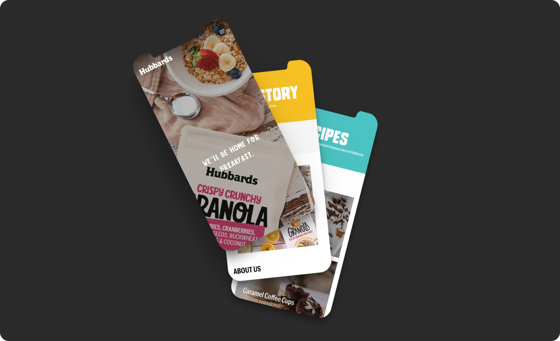
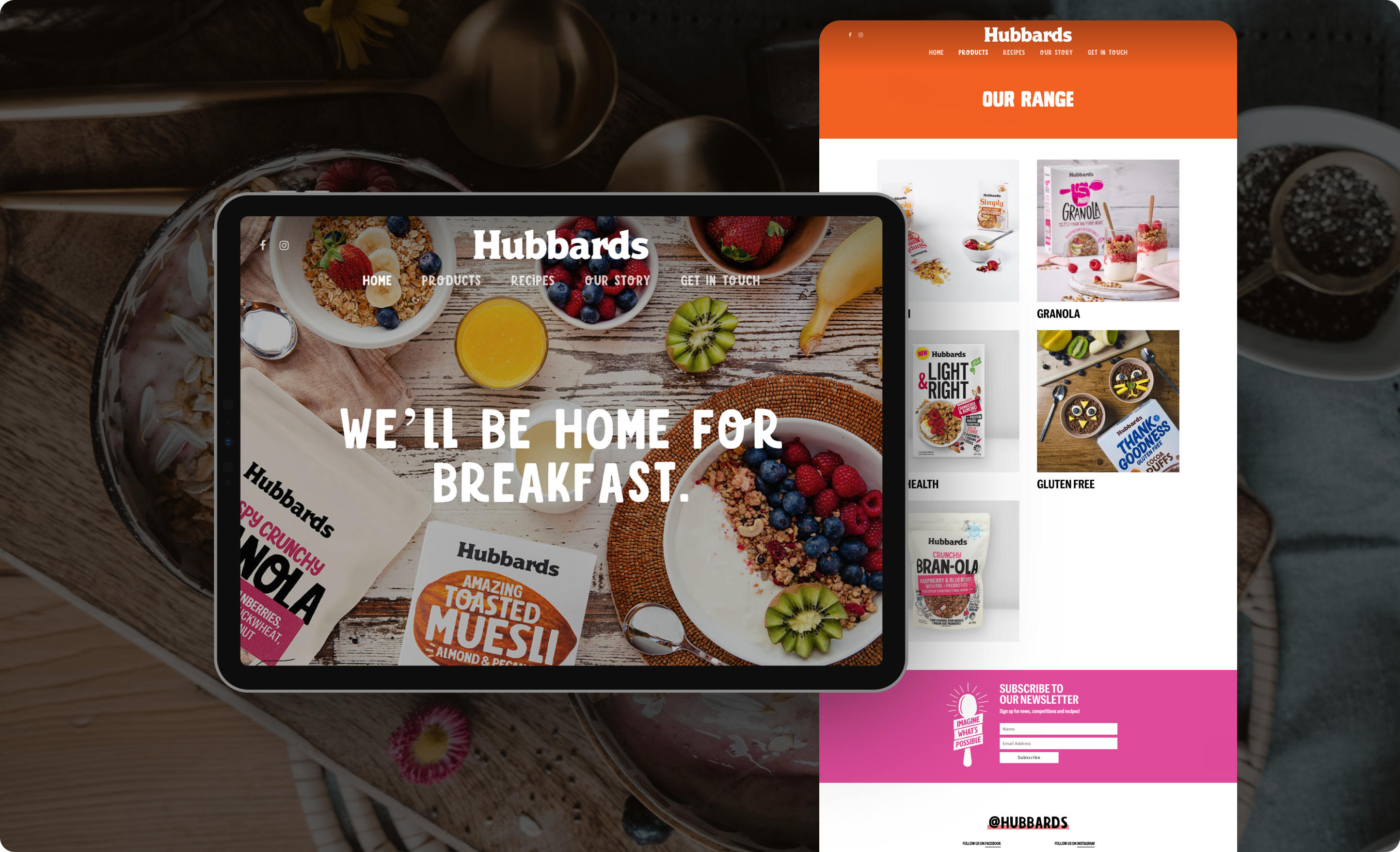
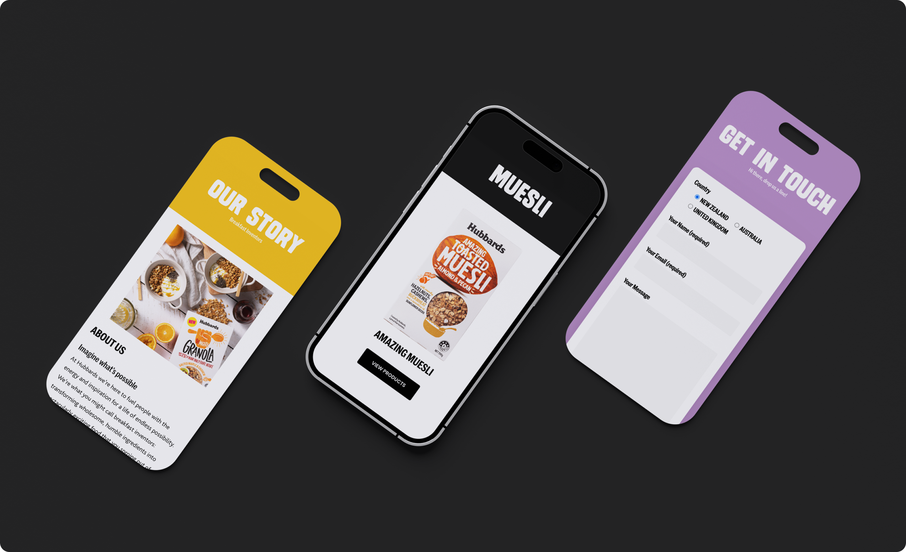
Our strategic redesign elevates Hubbards’ brand identity and user experience. The new website is not only visually appealing and easy to navigate but also functions as a powerful sales platform.
