Menu

Farmer Autovillage
Our Solution
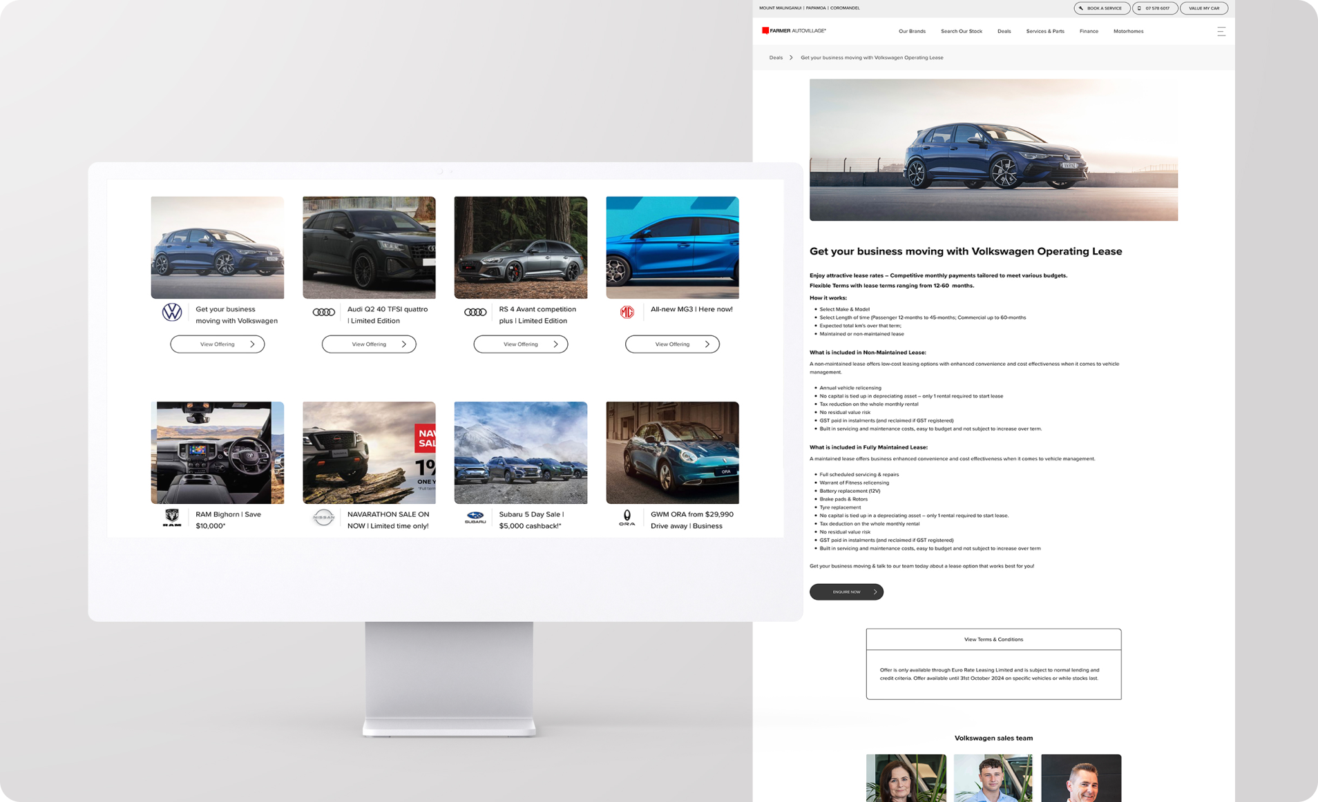
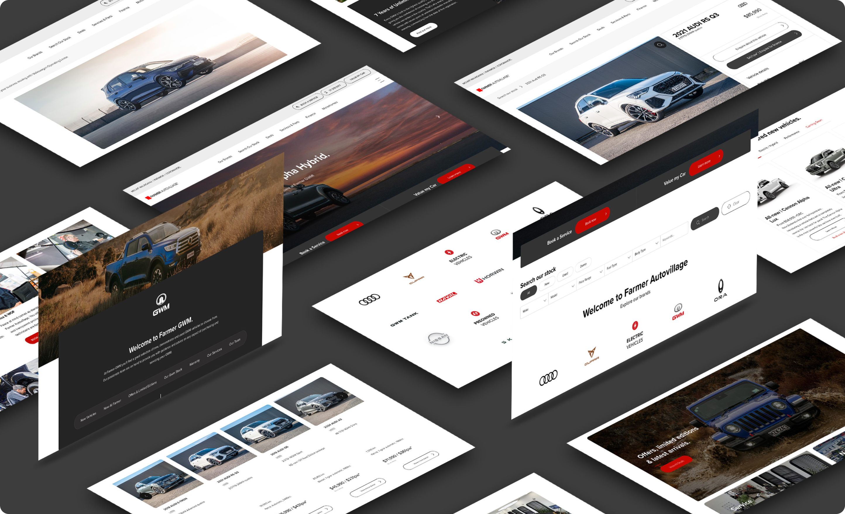
Farmer Autovillage approached us with a website in need of a major overhaul. We focused on three key areas: user experience, staff efficiency, and brand identity. We ensured a smooth connection with their Autoplay vehicle listing and lead management system, customising its appearance to align with their brand.
We created a customisable template specifically designed to showcase their 12 car brands in a consistent and user-friendly format. This template streamlines future additions and ensures brand consistency. Additionally, the previously scattered auto service descriptions were consolidated into a well-organised "Auto Village" section with a clear navigation menu.
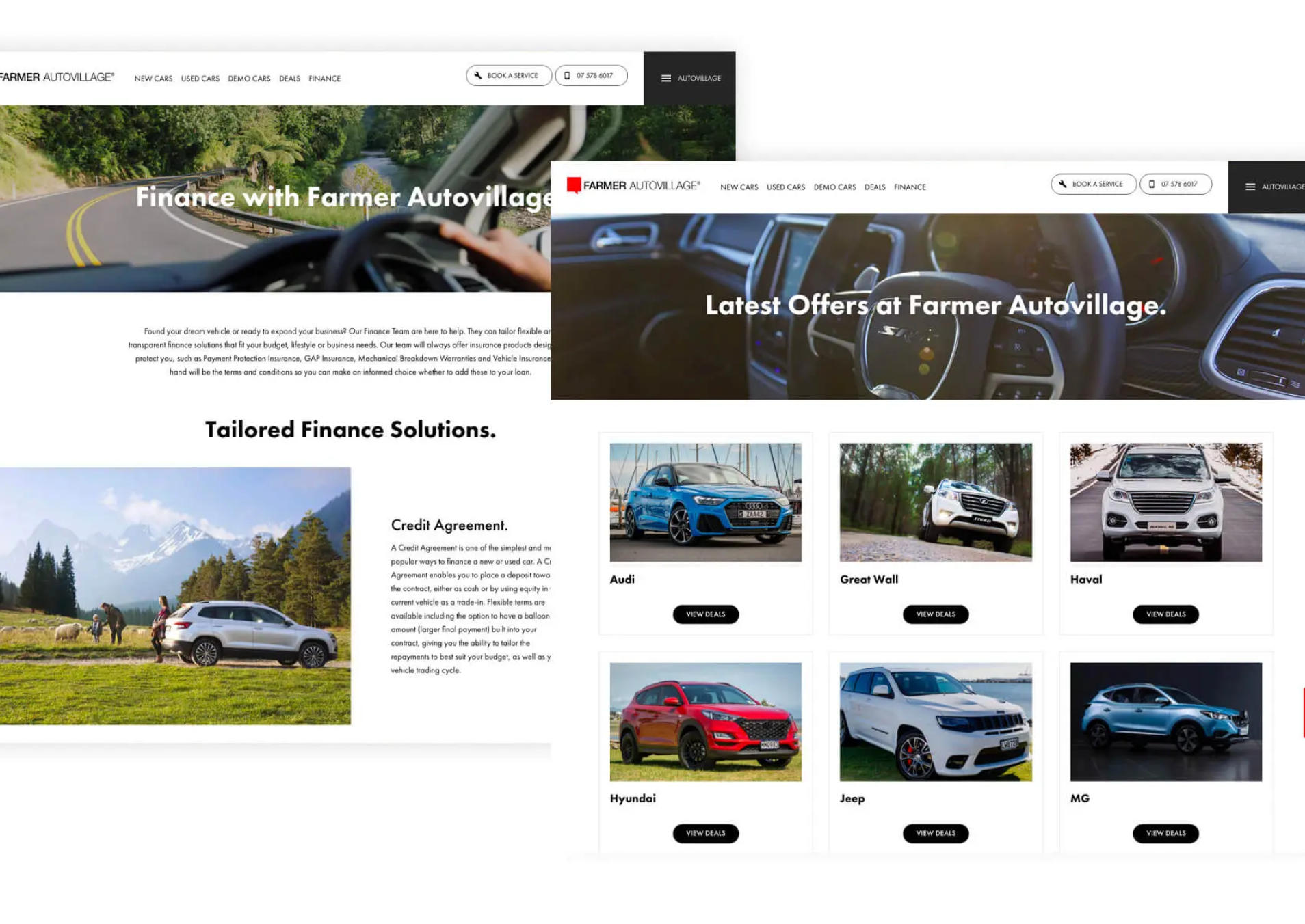

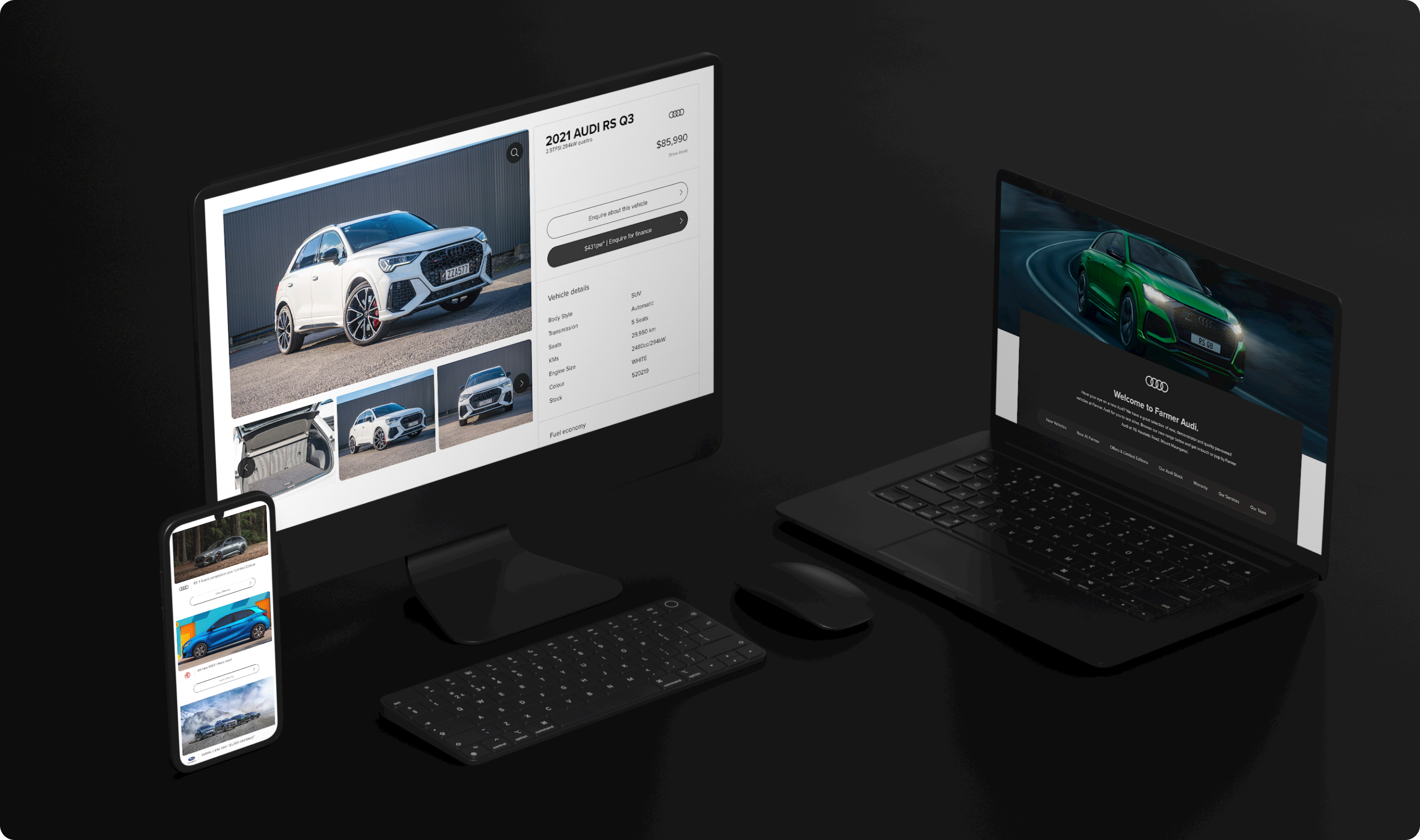
We built the website using WordPress, a user-friendly content management system. This allows Farmer Autovillage staff to easily update listings, manage marketing content, and promote current deals – freeing them to focus on their customers.
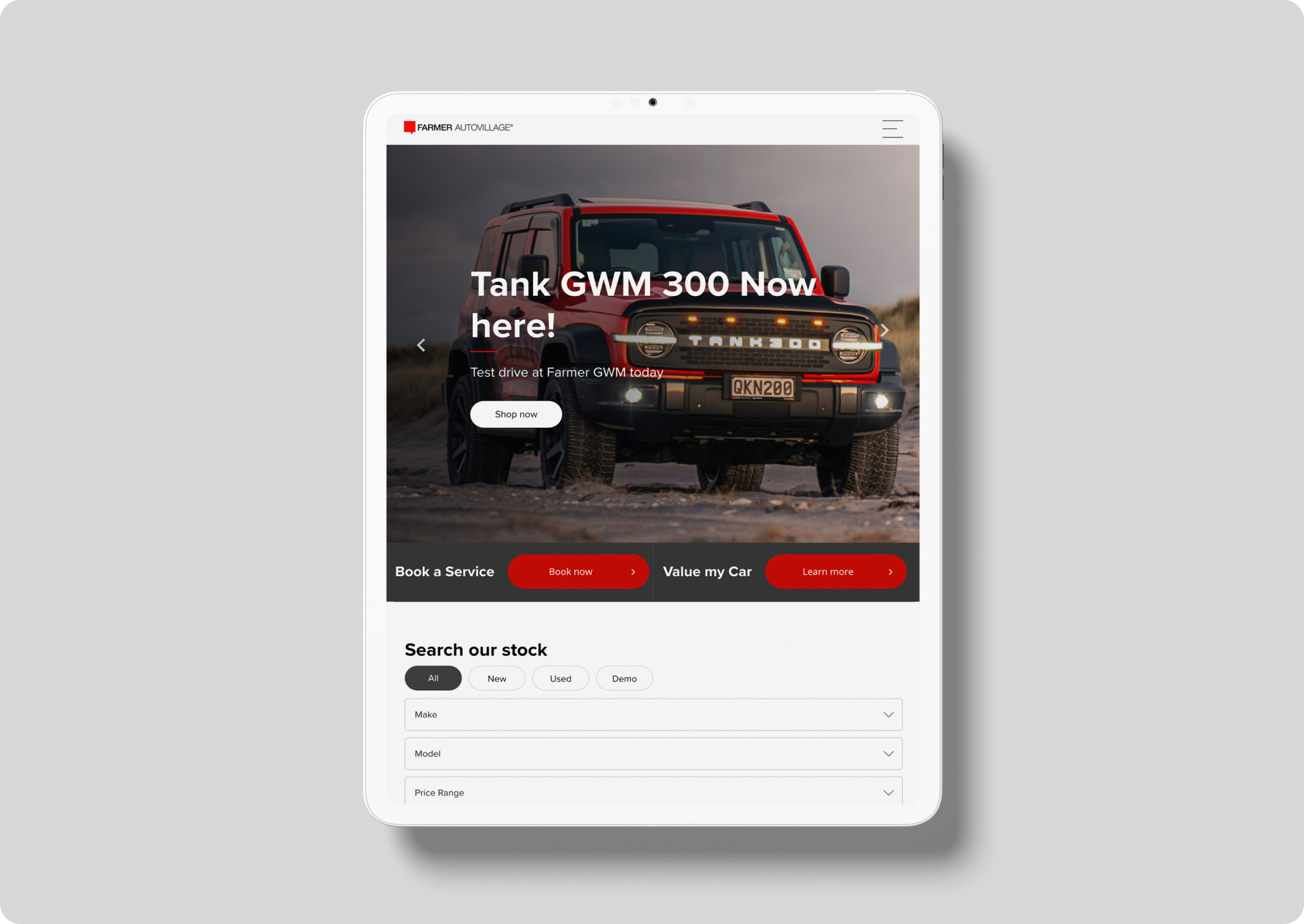
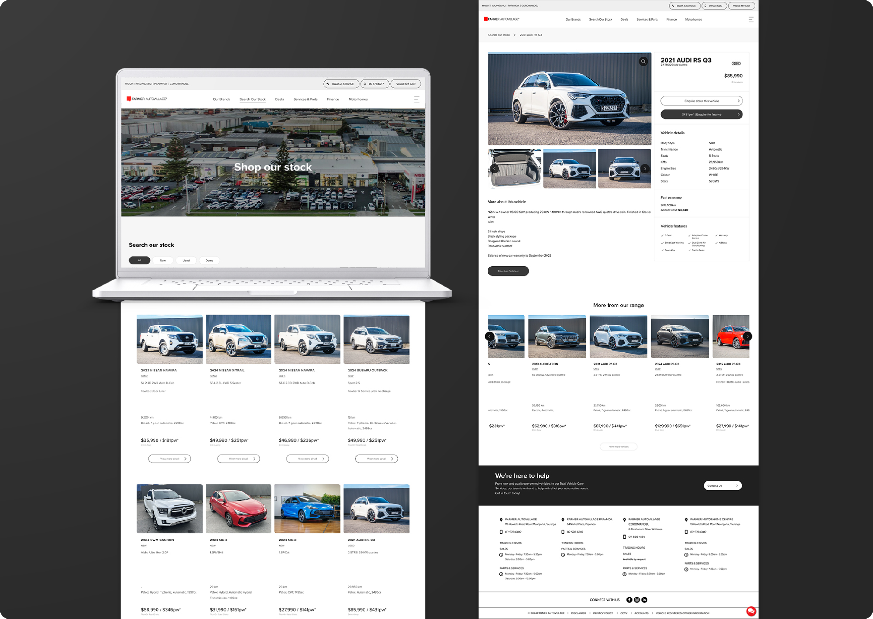
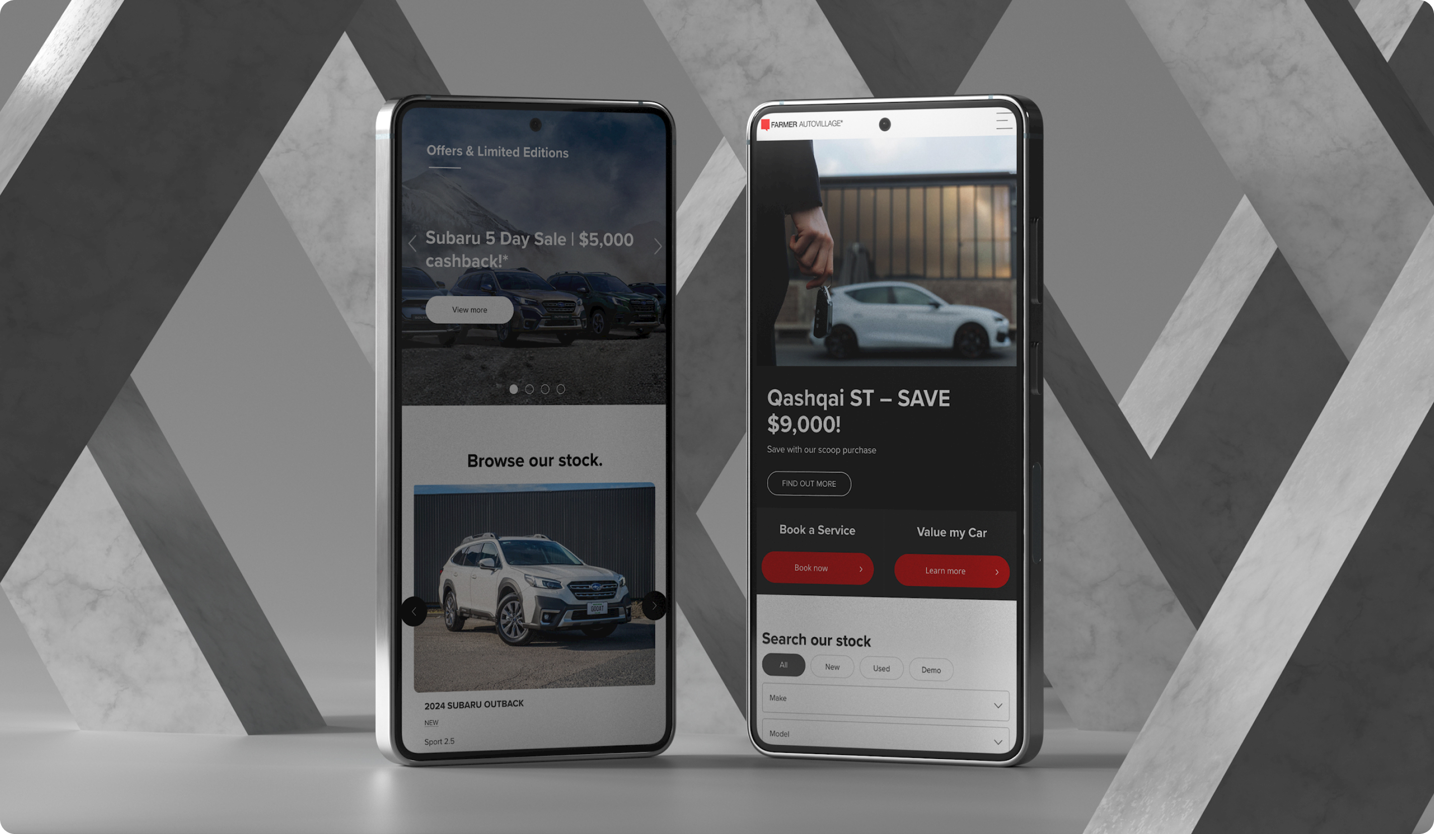
The new Farmer Autovillage website is not just visually appealing, but also user-friendly for both staff and customers. This solid foundation sets the stage for effective marketing, increased conversions, and ultimately, driving more sales.
